Redesigning a Live App Without Breaking It
I rebuilt the home screen of Yes or Mess while real players kept using it. Fourteen small releases, one stable preview link, and a launch date I moved on purpose. Here is the operating model, and what it means for any program that has to change a product people already depend on.
Most of the products we lead are already live. Members log in every day. Customers have habits. Somebody’s quarterly number depends on the thing working tomorrow morning exactly the way it worked this morning.
That is what makes a redesign hard. Building something new on a blank page is the easy version. Changing the front door of a product while people are walking through it is the real job.
I just did that with Yes or Mess, the reality TV prediction game I built and run. Today the new home screen goes live. This post is about how it got here without a single player losing a pick along the way.
Quick detour before you read on. If you lead a program that has to change a live product and the plan keeps slipping, the 8-question diagnostic takes about five minutes and lands in my inbox, not a sales queue.
The problem was hierarchy, not looks
The old Home looked fine. That was the trap.
When I walked through it like a player, the top third of the screen was a banner image, a greeting card and a row of buttons that duplicated the bottom menu. Then came a 10-row leaderboard. Then, finally, the player’s own picks. The thing people opened the app to do was the last thing on the page.
That is not a design problem. It is a priority problem that shows up as design. Every program I have run has a version of it: a dashboard where the metric that matters sits below six that don’t, a portal where the task members came for is three clicks deep, a weekly report where the decision needed is on page four.
So the brief was one sentence: get players to their picks faster. Everything else had to earn its place against that.
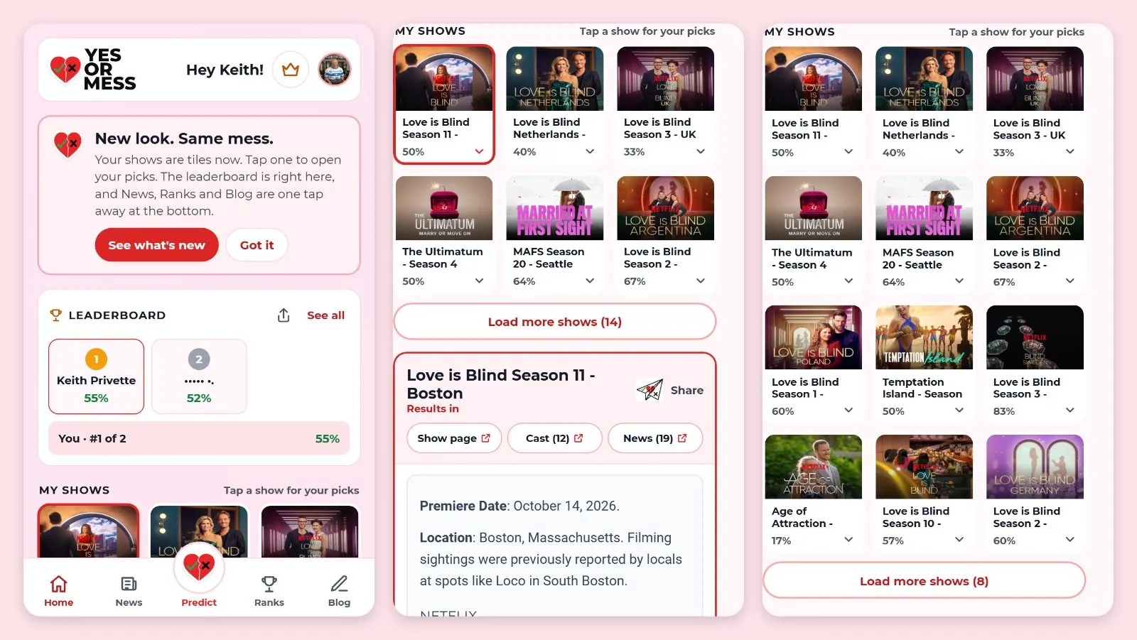
- Shows became tiles with official artwork, always on screen. Tap one and your picks open right there.
- The leaderboard shrank to a card: top 3 and your own rank.
- A single line under the greeting tells you when your next picks lock.
- The bottom bar went to five things: Home, News, Predict, Ranks and Blog. Profile moved to your picture in the corner.
I did not get there in one pass. I reviewed three rounds of mockups, tested them against real show art, and picked the third. The first two were not wrong. They just answered a slightly different question than the one I had written down.
A release branch and one link for everyone
Here is the part I would steal for any enterprise program.
All the redesign work went to a separate release branch, never straight to the live site. One draft release stayed open the whole time, and it came with a single preview link that always showed the full redesign as it stood that day. Every individual change also got its own preview link so I could test that piece alone.
That gave me three things most programs struggle to get:
- The live product never moved. Bug fixes still shipped to players on the normal path while the redesign grew next to it.
- One source of truth for review. Not a deck, not a screenshot in an email thread. A working link. Anyone could open it on a phone and react to the real thing.
- Launch became a non-event. Going live is merging one release that has already been tested for two weeks. No big-bang cutover weekend.
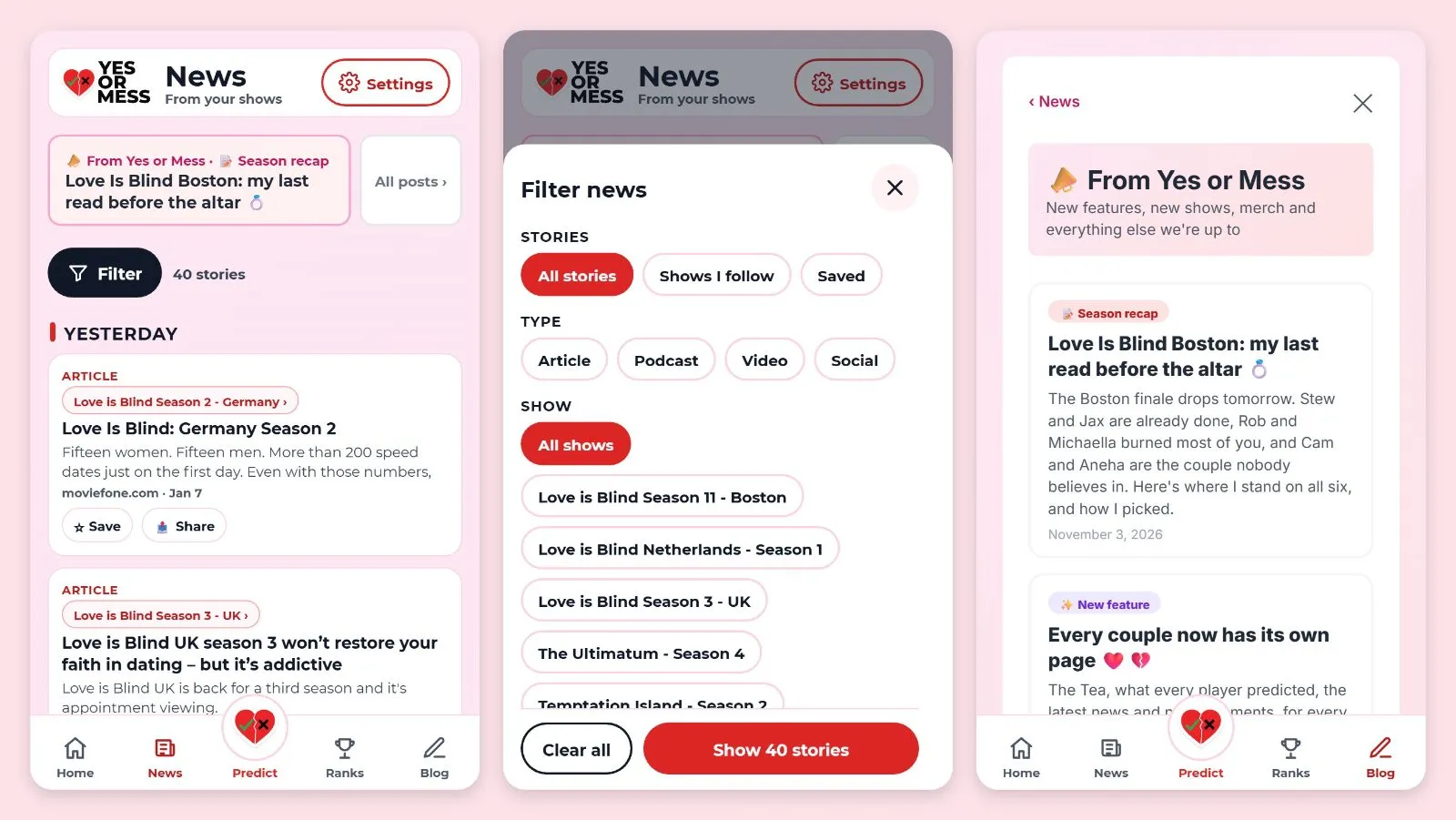
Between October 21 and today that branch took fourteen small releases: navigation, show tiles, the leaderboard card, links to every show and cast page, brand pages for each show, official artwork for more than 20 shows, a rebuilt logo, refreshed emails and an admin tool that imports a cast list in seconds. Each one was small enough to test in a few minutes and easy to reverse if it was wrong.
The guardrails that mattered most
The preview links run against the live database. That is what makes the testing honest: real shows, real couples, real picks. It is also what makes it dangerous.
Two actions in this product email every registered player: creating a show and publishing a blog post. If either happened by accident on a preview, every player would get a confusing email about something that did not exist yet.
So those rules are written into the project’s working notes, at the top, in plain language: test with your own account, never create a show to test something, never publish a post to test something. The blog editor has a “send a test email to me” button for exactly this reason.
Every program has its version of the “emails every player” button. A payment run, a member notice, a provider file that goes out at midnight. The question to ask before any testing starts is simple: what can this environment do that cannot be undone? Then write the answer down where everyone will see it.
Moving the date was a decision, not a slip
The first plan had a launch date of October 28. The scope grew. Show pages turned into proper brand pages, the artwork had to come from official press kits instead of whatever was convenient, and the logo needed a rebuild because the old files had soft edges and no real transparent background.
I moved the launch to November 4 on purpose, a full week before it would have become a crisis, and I said why in the plan. The plan also named what could be cut if testing ran long: the show brand pages could launch a few days after the rest as a second announcement.
That is the difference between a slip and a decision. A slip is discovered. A decision is made early, with the trade-off written next to it.
Quality is a standard you state out loud
Two small examples that say a lot.
Artwork. It would have been faster to crop show images out of the banner I already had, or pull them from an image search. Instead every show tile and show page uses official press art, with the network credited and a Watch button pointing to where the show streams. Slower to set up, but it is the right asset, it looks professional, and nobody has to wonder whether we had the right to use it.
The logo. The sticker edge around the heart looked sloppy at small sizes. “Crisp, not sloppy” became the written standard, the logo was redrawn as clean vector files, and now every size from a favicon to a social banner comes out of one source.
Neither of those is a technical skill. Both are a leader deciding what “done” means and refusing to accept less.
What I would bring to your program
If you are the one who has to change a live product without breaking the business that runs on it, this is what I would put in place first:
- A one-sentence brief. If the redesign cannot be described as one outcome for one user, it will turn into a list of opinions.
- A release branch and one stable preview link. Stakeholders review the real thing, not slides about it.
- Small releases with a reversal plan. Each change small enough to test in minutes and undo in one step.
- A written list of irreversible actions. Whatever in your environment emails customers, moves money or sends a file, named before testing starts.
- Dates moved early, with the trade-off stated. Decide at the first sign, not the last day.
- A quality bar in plain words. “Official assets only.” “Crisp, not sloppy.” Something anyone on the team can check without asking.
None of these need a new tool or new headcount. They need someone to own the decisions.
See it for yourself
The new Home is live today. If you want to see what came out of all this, here is the player-facing announcement, and the game itself is free at yesormess.com.
And if you have a live product that needs to change and a plan that keeps sliding, start with the 8 questions. Five minutes, one active program, and you will know where the drag is.
Business is technology and technology is business.
Keith Privette
Views are my own and do not represent my employers.